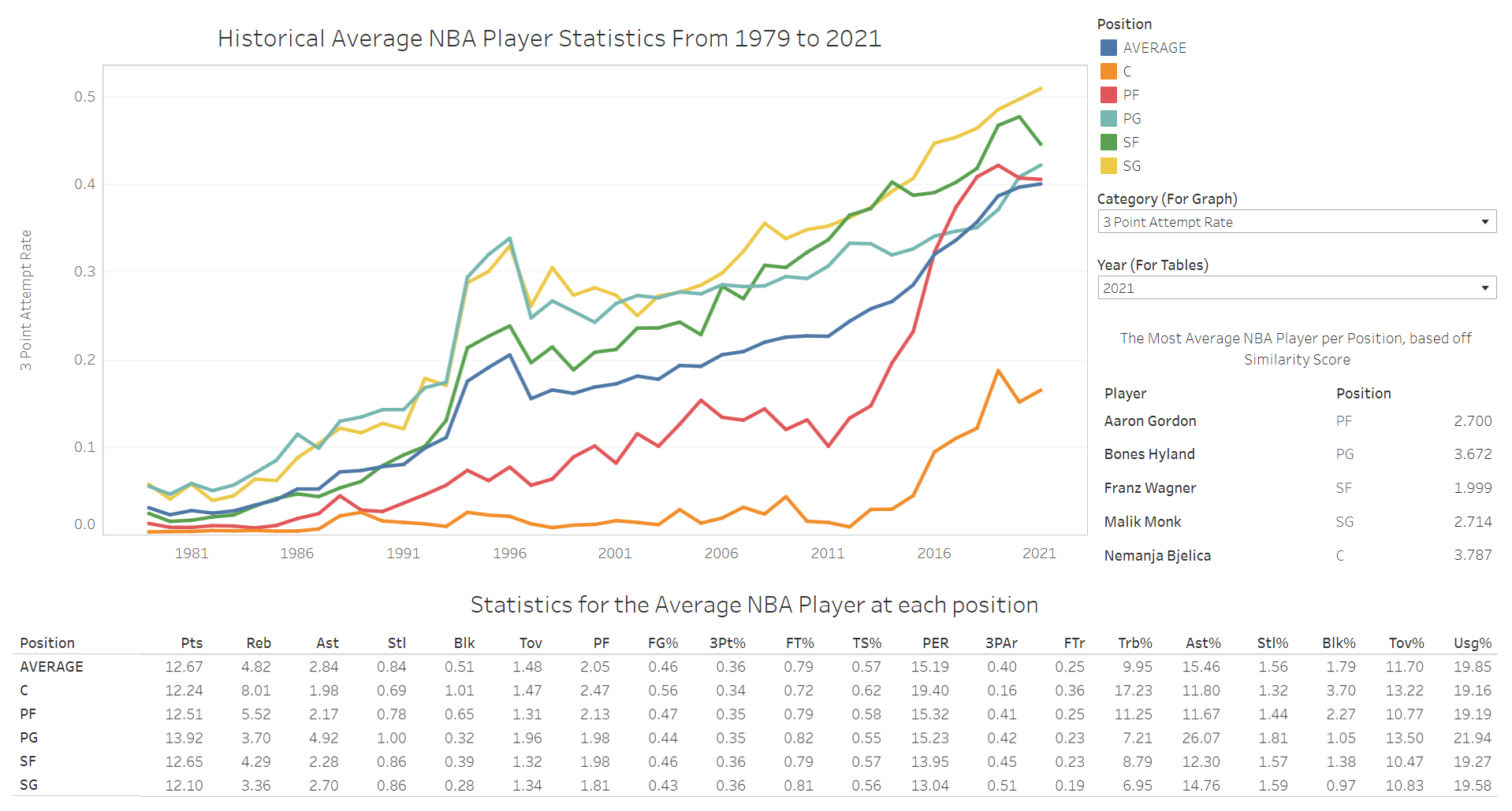
A screenshot of the Tableau Dashboard, which allows users to view the average statistics by season and position, as well as the most average player per position for each year.
You can view the GitHub repository here.
As an NBA fan, I often see discourse on the levels of competition for different seasons. While there are various methods to approach this problem, I decided to analyze the averages for 20 different statistics by position starting from the 1979-80 season (when the 3 point shot was introduced). To eliminate outliers due to limited minutes played, I only considered the statistics for players that played in 70% of the regular season games for a season, or the equivalent of 1000 minutes in an 82 game season. A player's "averageness" was determined by a similarity score, which was the sum of the percentage difference for each statistic.
I sourced my data from basketball-reference.com, which came in the form of .csv files. I aggregated these files into a database using SQLite so that I can efficiently analyze them using SQL. Since there were null values in the data that would impact my analysis, I used SQL to clean the data. I then planned my analysis by analyzing the data for one season using Excel. I used this as a reference to ensure that my sql queries were accurate. The analysis was done using views that incorporated SQL joins and subqueries that incorporated multiple tables. The database ultimately contained 88 tables, 172 views and over 25000 entries.
After conducting exploratory data analysis, I developed a dashboard using Tableau to gain further insights. The dashboard showcases a line graph that visualizes the progression in different statistics by position (including the overall average), a table containing the averages for a season by position (including the average overall player), and a table displaying the most average eligible player by position, determined by the lowest similarity score. The dashboard allows users to sort by position, statistic (line graph) and year (tables). Alongside the dashboard, I wrote an article on Medium explaining my analysis and how specific trends could be explained by historical NBA events/rule changes.